Northwestern Mutual is a Life Insurance company that continuously looks for innovative ways to create value for its clients. The purpose of this new product is to help clients be financially free from their student loan debt by reducing the amount paid towards their student loan; obtain adequate life insurance coverage; build savings for future financial goals.
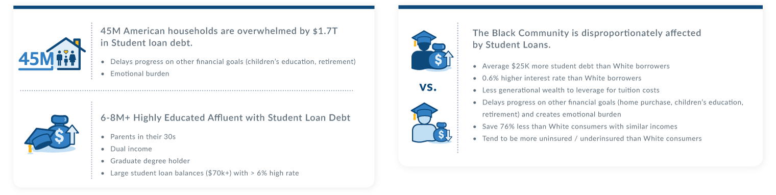
Given that the Black community is disproportionately affected by student loans, Northwestern Mutual seeks to mend the cycle for the millions of Black Americans who are overwhelmed by their educational debt and find ways to help clients protect and prosper.
The Approach
01 Research
Quantitative analysis
User Interviews
User Profiles
02 Design
Informed Brainstorming
Financial Illustration Design
User Feedback
Lo-fi & Hi-fi Wireframes & Design
Interactive Prototype
03 Evaluate
Usability testing
Design iterations
My Contribution
I led the design activities and worked closely with product directors and engineers to create low and high fidelity wireframes for a web application experience, along with interactive prototypes for user testing and feedback. I participated in online user interviews via Zoom and brainstorming sessions which helped me get a better understanding of the product offerings. This was important since I also needed to create the supplemental financial illustrations which would be generated from the application.
The research was completed and the user profiles were defined prior to me joining the team. This case study will dive deeper into the Illustration design process and web application development.
Problem Statement
45M American households are overwhelmed by $1.7T in student loan debt which delays their financial progress and creates an emotional burden. Moreover, the Black Community is disproportionately affected by student loans.
The purpose of the pilot is to help clients be financially free from their debt by reducing the amount paid towards their student loan; obtaining adequate life insurance coverage; build savings for future financial goals.
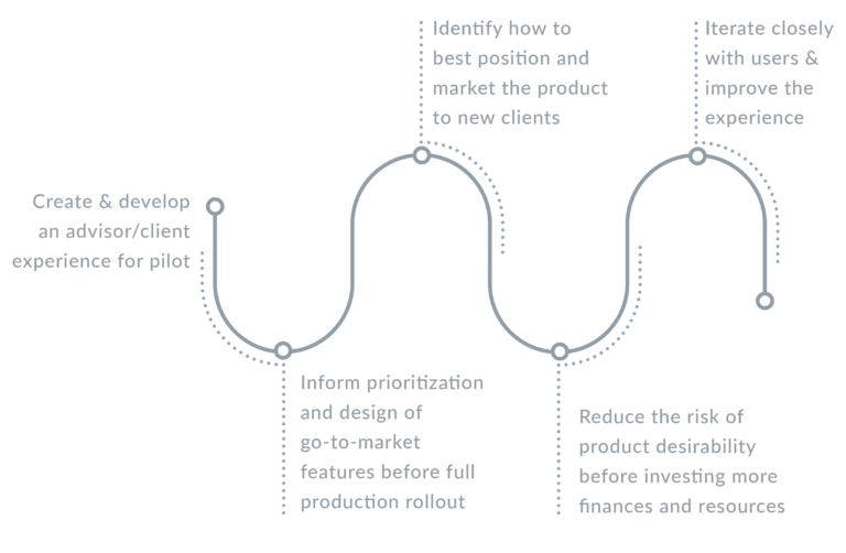
Road to MVP
Goals (what would success look like):
Feature Prioritization:
In order to meet those goals, we prioritize five (5) main “Jobs to be done”:
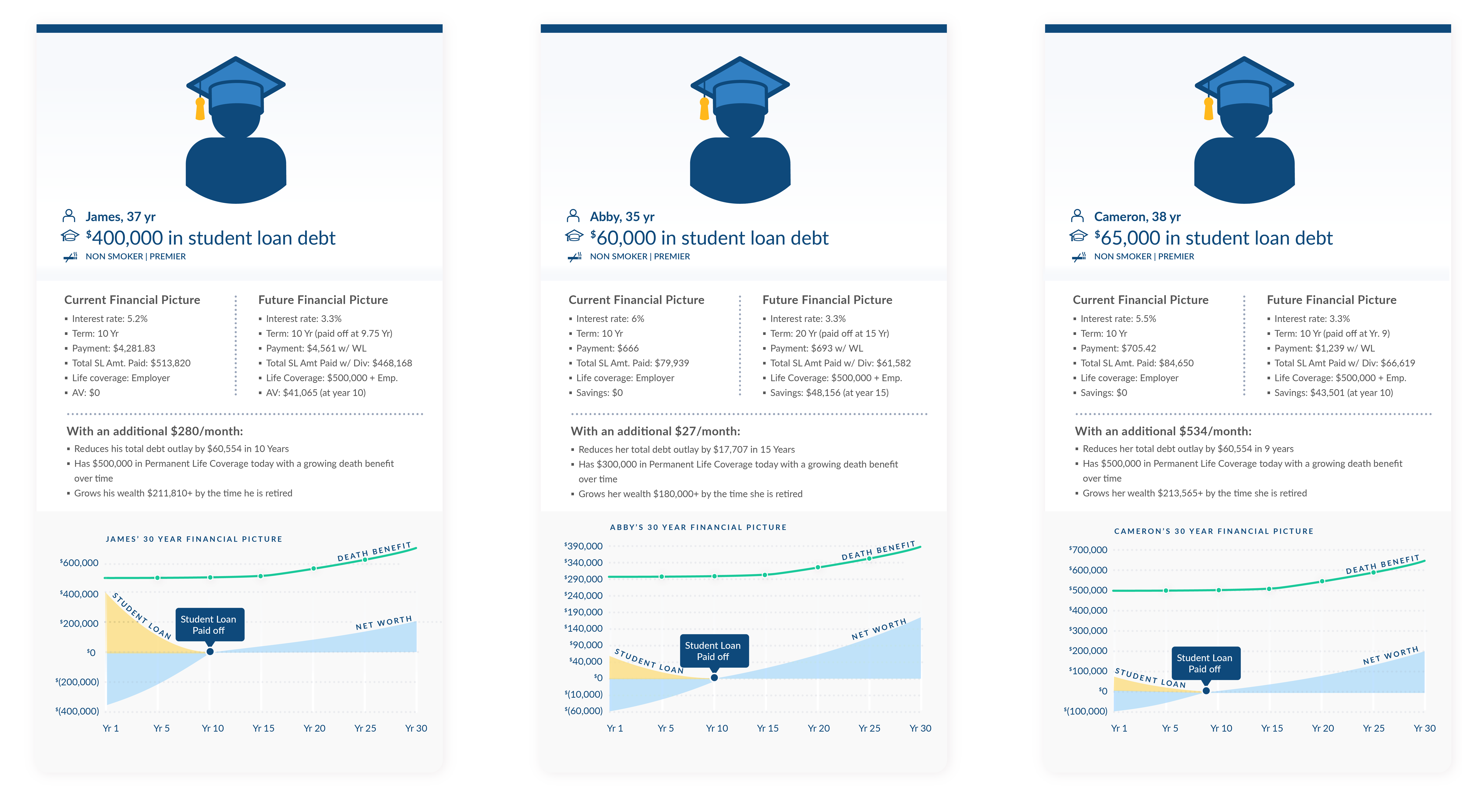
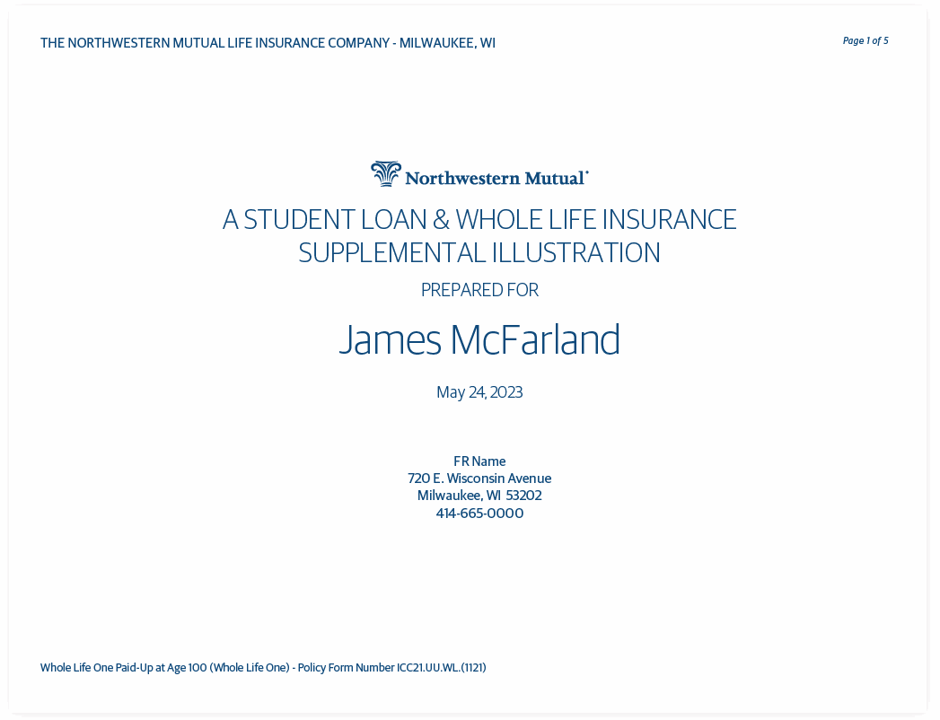
Create three (3) different supplemental illustration templates which will capture the majority of the student loan cases. Those financial illustrations will be offered to new policy owner by their financial advisors and will explain how the policy will perform under specific circumstances.
Develop an advisor/client tooling that will generate the illustrations after uploading the necessary documents. Advisors must be able to generate as many illustrations as they need.
Safely and securely send the documents to the policy owners for electronic signature.
Ability to keep track of sent illustrations and opportunity to follow up and resend documents.
Ability to keep track of the enrolled clients.
Supplemental Illustrations Design
The illustrations need to serve two purposes:
(1) Be a helpful tool for the Financial Advisors to adequately position and market the product to new clients by clearly explaining how the policy or the money invested will perform over a period of time and help with paying down their student loan faster.
(2) We wanted the illustration to be a trusted document that the client will take home and share with their families. For this to happen we try to use neutral language wherever possible and call out the most important and relevant number to help new policyholder to make an educated decision. We wanted them to be able to understand the concept and feel confident discussing it with family members.
User Profiles:
Excising illustration design and why it didn’t work.
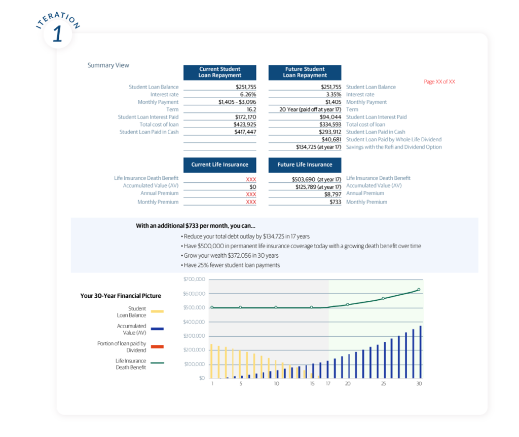
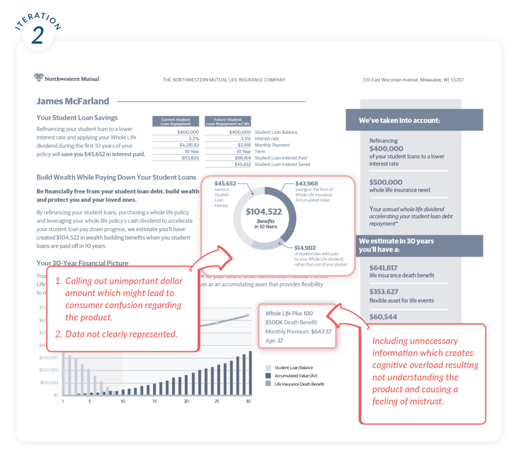
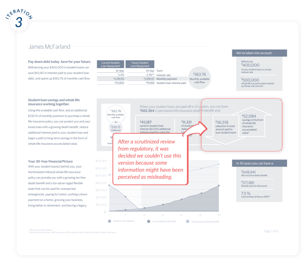
We kicked things off by exploring the existing financial illustration design. Unfortunately, they didn’t meet the initial criteria – to be easy to understand and navigate, and to be a “marketing-looking-like” document. We went through multiple rounds of financial advisors’ interviews and illustrations iterations to create the document that the financial advisors needed. Below are some of the most successful attempts, accompanied with comments on why ultimately we moved away from them:
We moved away from this concept page layout because we couldn’t tell a compelling story and clearly describe how the new product would benefit future policyholders.
Also, it didn’t emphasize on the important dollar amounts – it was just… a sheet of numbers that you couldn’t get excited about.
We tried to emphasize with the customer. Choosing the right life insurance policy is hard enough, so we made a conscious effort to keep things simple, well structured and easy to find.
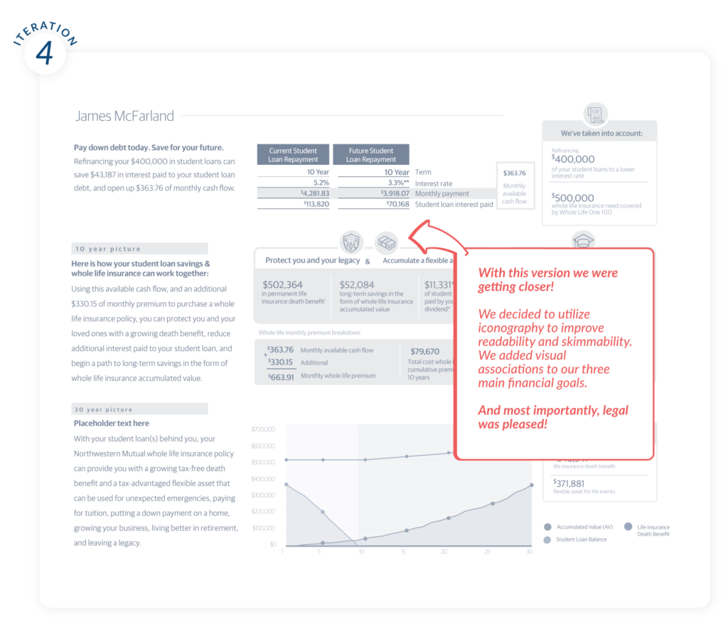
Hooray!
Here is the final version. Using icons and grouping certain information together improved the cognitive load, which is important in order to make a complex subject like life insurance more understandable. We ended up developing four different templates with which we covered the most common client cases.
In the end, I handed verbose documentation over to the developers and tackled the web application experience.
Web Application Design
Build advisor tooling that helps generate illustrations and keep track on sent out and signed documents .
One of the most difficult parts, in the beginning, was understanding the Northwestern Mutual product ecosystem, what the Financial Representatives are used to using, and how the information has been structured. Another roadblock was figuring out how the application would be accessed which would influence the design choices.
Main app characteristics:
Strip to the bare-bone features
Minimalistic and straightforward design
Stream process (one task per screen)
Utilizing the corporate design system and component library
Initial user flow - Low-fidelity wireframes
Initial user flow - Hi-fidelity wireframes
We translated the initial user flow into high fidelity prototype which we tested with selected advisors. Some of the challenges we faced and compromises we need to make were related to not having a Save State which would have resulted in more development time and resources.
As part of the innovation process, you should always be ready to pivot fast, forget everything you thought yesterday and start from scratch whenever needed. After learning where the app would live and how it would be accessed, we needed to completely rethink and rework the user experience.
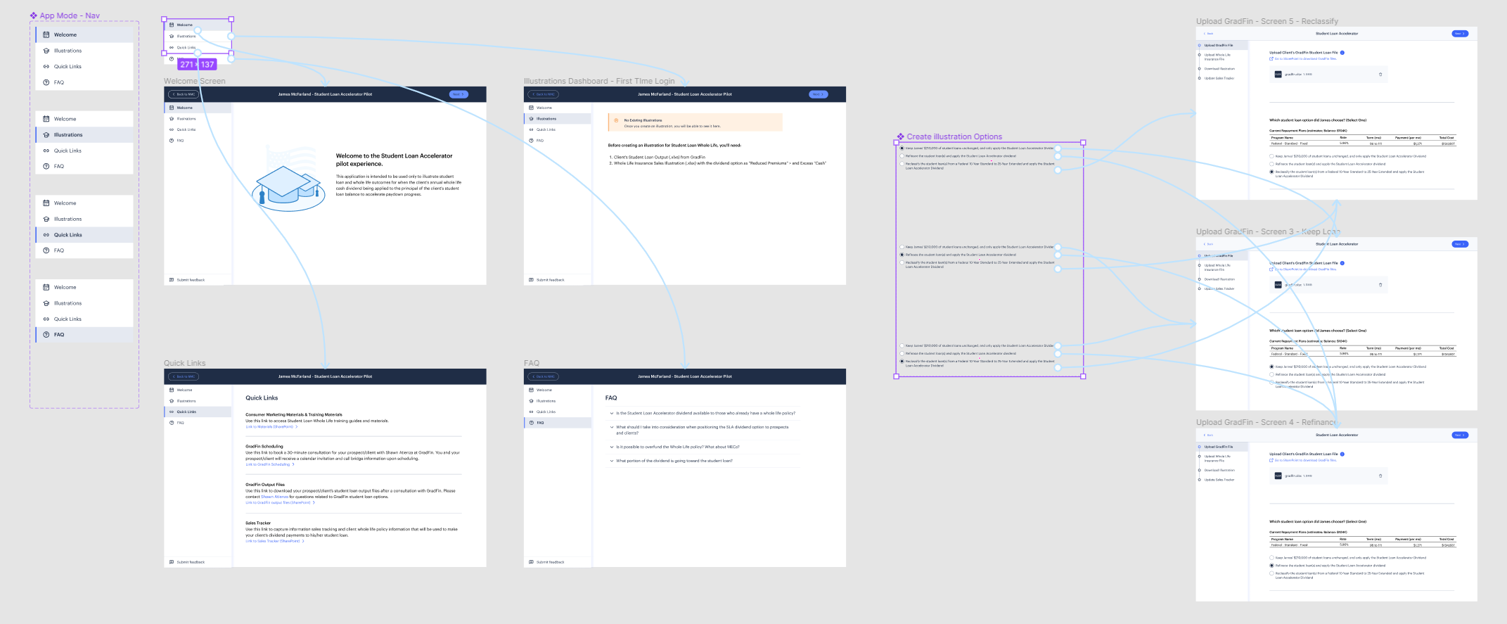
We replaced the top stepper with a side navigation.
The multi-step process was made apparent by indicating progress with steps remaining on the side navigation. At every step along the way, the FRs could see what was happening, their current progress, and what was next.
For the side navigation we also used a two-factor distinguished elements. The element in the hover state had a different font weight and also has a background. This type of two-factor distinguisher reduces the cognitive load on users as it is now a lot easier to tell the two states apart.
Learning to use a new tool is challenging enough, so we focused on clear labeling to indicate when and where the FRs (financial advisors) were required to provide input or move forward. For any blank states (zero-data screens), we provided clear call-to-action buttons (top right) so users were sure about the next step.
The Welcome screen provides good empty state for user onboarding when the product is first launched. The call-to-action button helps to proceed without wondering what to do next.
After generating the illustration, the next time when the advisors log in, they will be presented with a illustration dashboard filled with default data.
Final interactive prototype
The most satisfying part of working on an application design, is to prototype it and make it interactive. I tried to work smart and be efficient while prototyping.
One of the timesavers was prototyping the components and variants, and placing their instances on the corresponding screens, instead of manually connecting every single step in the navigation with the correct screen.
Public launch
Finally, it was time to launch the MVP to our Beta users – There were twenty (20) preselected Financial advisors, who needed to be onboarded and trained on how to use the application.
Using the feedback we received after the launch, we continue to improve and polish the application by including icons for easier readability, adjusting the spacing between blocks of content, and adding dividers and error states.
In the end, we made sure that the app’s user flow was designed with constant feedback and clear actions for users to take.
Closing Thoughts & Reflections
Financial applications are seemingly at a disadvantage because of regulatory and legal requirements. However, in UX, these limitations can be a blessing and provide a structure for designers to work with. With a small amount of extra effort and thought, creating clear and simple experiences is actually made easier when requirements like regulations need to be followed.
This product was bored in a truly innovative agile environment. Our empowered cross-functional team took action as soon as possible, failed early and often, and we did not wait for perfect solution. In the end, we delivered a product that everyone one of us was incredibly proud of.