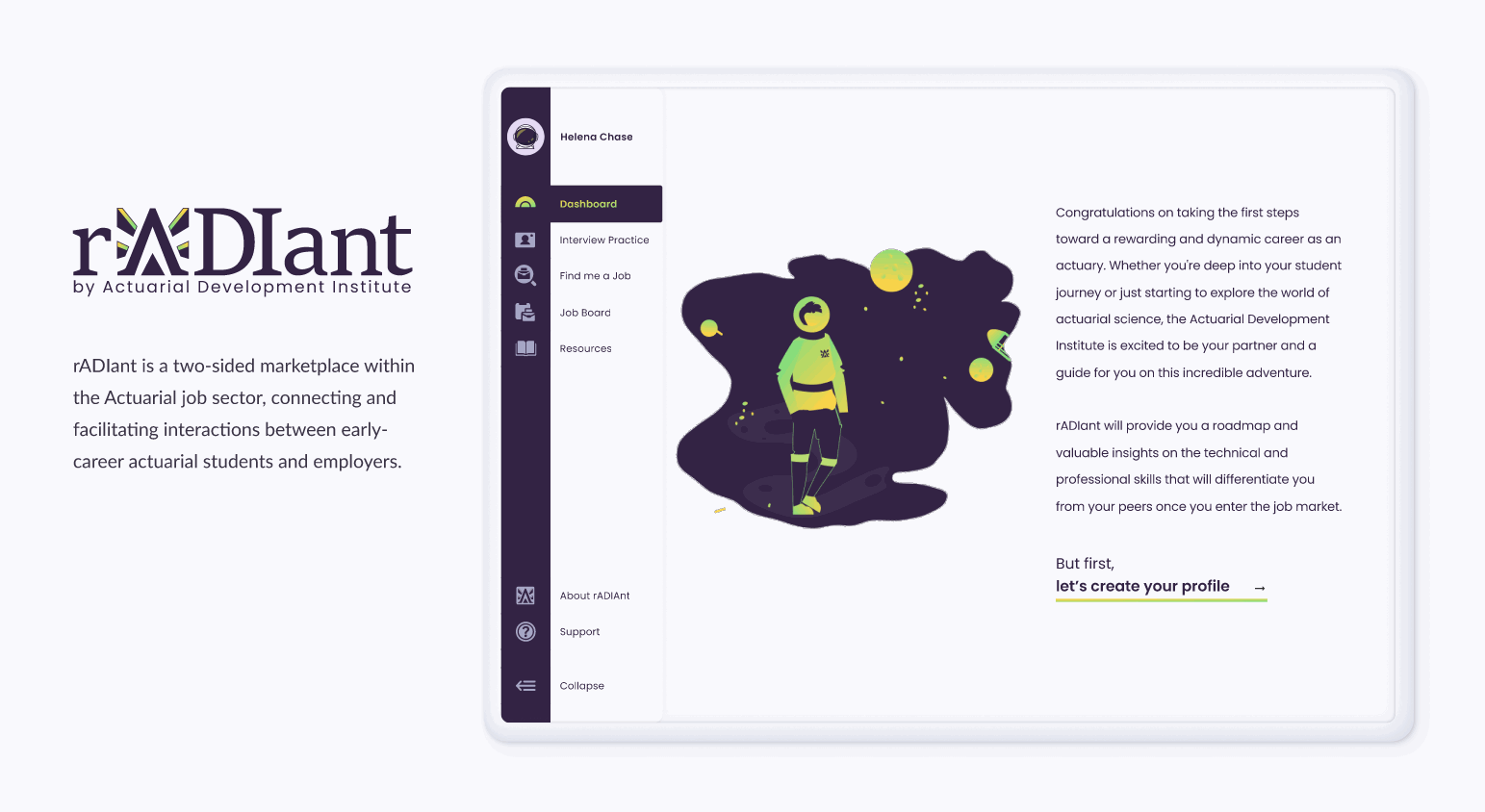
rADIant, a brand extension of Actuarial Development Institute (ADI), is an online platform specifically designed for early-career actuarial students.
It provides dynamic feedback on employment profiles, emphasizing key competency indicators like exam progress, coding skills, technical projects, and exposure to the insurance industry, all while considering the student’s proximity to graduation date.
In parallel, rADIant supports employers by meticulously curating a searchable database of qualified students, surpassing conventional recruitment constraints and facilitating streamlined connections within the Actuarial job market.
The remainder of the case study will primarily focus on the student-centric features and experiences offered by the rADIant platform.
Problem Statement
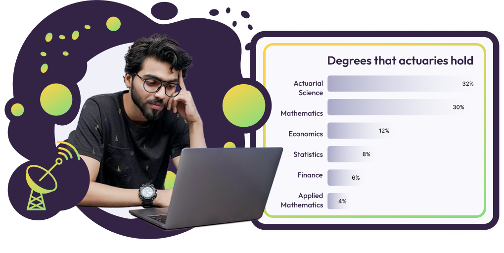
While Actuarial Science majors are not uncommon, individuals aspiring to pursue careers in the field often come from diverse academic backgrounds, including majors such as mathematics, statistics, finance, or economics. The difficulty arises from the lack of standardized benchmarks, leaving university students without a clear understanding of their competitive positioning.
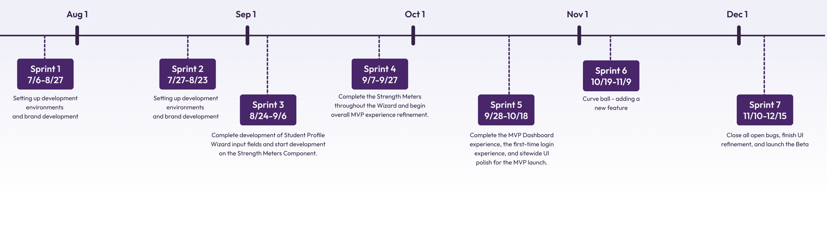
The initial two sprints were devoted to distinct aspects of the project. On the engineering front, the team focused on setting up the backlog, configuring Azure cloud services, creating Dev, QA, & Prod environments, and implementing authentication and more.
In parallel, on the design side, efforts were concentrated on establishing the brand identity, which involved defining color schemes, crafting illustrations, and creating the logo —a crucial step for initiating product promotion while concurrently shaping the application experience.
The Road to MVP
For the MVP, our primary focus was on enriching the student experience and integrating as many value-added features as possible. The expansion of employer experiences was deferred to phase two of the project.
Interviews & Online Forums
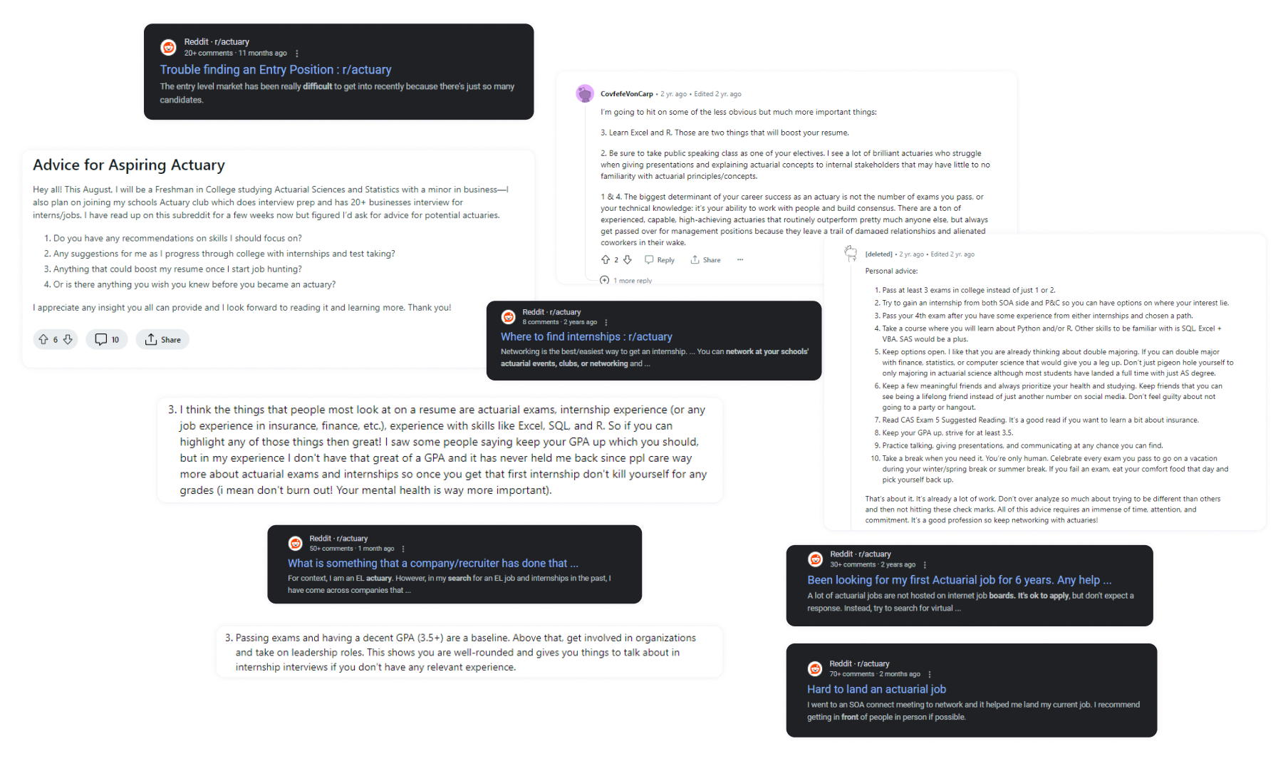
The founder, a Fellow of the Society of Actuaries with over a decade of corporate actuarial recruitment experience and strong connections with universities and students, served as a valuable source of knowledge and provided an excellent foundation for the project.
Furthermore, we effectively engaged with early-career students, extracting valuable insights into their perspectives on the current job market. Our research findings, drawn from discussions with potential users (junior and freshman actuarial students) and exploration of various online forums, played a crucial role in confirming and validating our initial hypotheses.
Research Insights
Absence of standardized benchmarks, left university students unaware of their competitive standing.
Students were actively searching for opportunities to practice interview scenarios, become familiar with the interview process, and gain insights into common interview questions.
Students faced uncertainty in finding a clear starting point when searching for their first job or internship. They needed to discern the expectations and requirements recruiters and companies had for early-career candidates.
Students don’t have a good way to network, and meet professionals in their field.
MVP Product Goals - How Might We’s?
How might we help students to identify and bridge educational and work experience gaps?
How might we enable students to practice video interviews with confidence in a secure and judgment-free environment?
How might we allow students to create a default resume format aligned with employer expectations?
How might we foster seamless connections between students and job opportunities, ensuring they feel prepared and qualified, for a confident transition into the workforce?
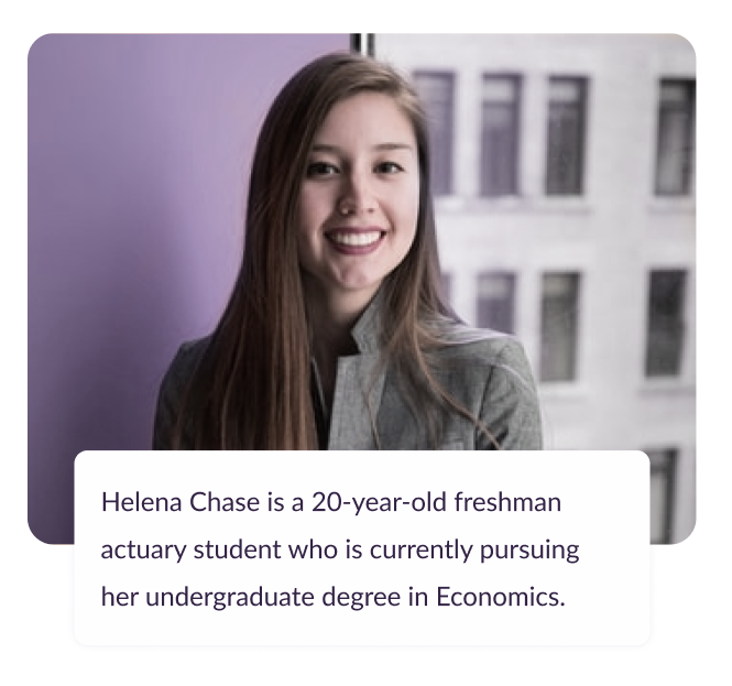
User Persona
Based on research insights, we created a student persona in collaboration with the stakeholders. This step was crucial because it would determine the information, features, and how the Strength Meter would be calibrated for the MVP, guiding us in making certain decisions.
Wants
Find Work or Internship Secure either a part-time job or an internship that allows her to apply his skills and knowledge in a real-world setting.
Assess Marketable Skills Find a way to identify areas where she needs to improve and increase her chances of employment.
Interview Practice Enhance her interview skills to increase her chances of securing a work or internship opportunity.
Needs
Lack of Direction Helena seeks guidance on kickstarting her career by identifying relevant companies, job boards, and industry resources.
Skill Assessment Helena seeks help in assessing and enhancing her marketability by evaluating strengths, weaknesses, and identifying areas for improvement.
Interview Preparation Helena desires focused practice for actuarial interviews to boost confidence, handle common questions adeptly, demonstrate technical knowledge, and articulate her passion effectively.
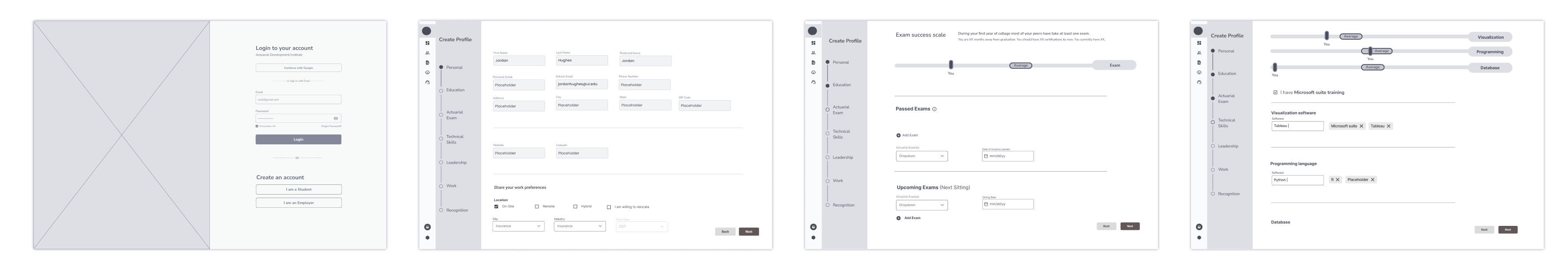
Selected Initial Wireframes
Visual Design
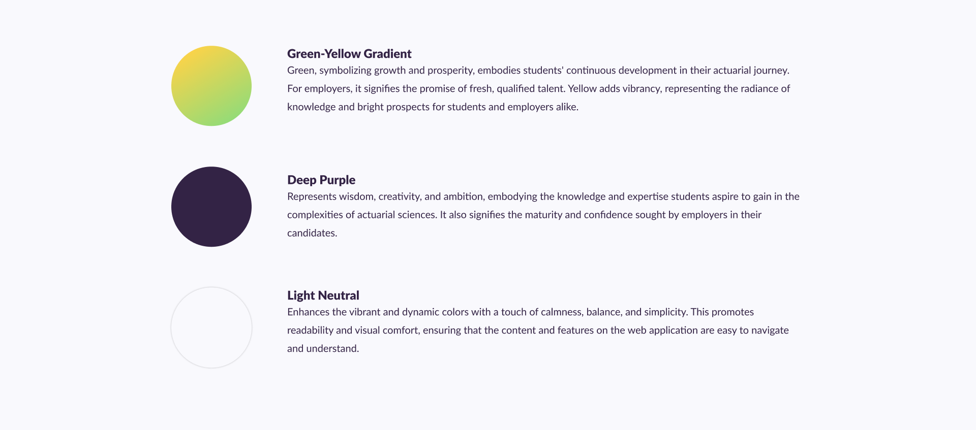
The actuarial field is often perceived as rigid with a less-than-attractive visual appeal. Following research and discussions with the rADIant team, we collectively decided to steer clear of the color blue, considering its overuse in various actuarial companies and resources.
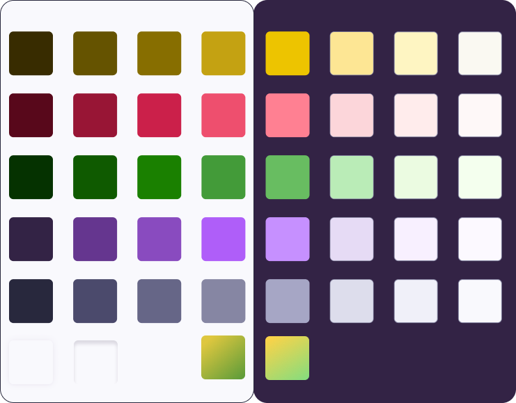
Given our target demographic of early career students, I proposed a distinctive color scheme comprising deep purple, a green-yellow gradient, and a very light neutral color. This combination aims to create a harmonious and visually engaging experience for users, setting a tone of professionalism, ambition, and optimism.
Accessible Color System
Once the brand colors were selected, I proceeded to establish a design system. Through some trial and error, I concluded that we required 8 distinct values from each color, spanning across a neutral palette. As the process unfolded, we also introduced additional colors, such as shades of red, along with opacity values and drop shadows.
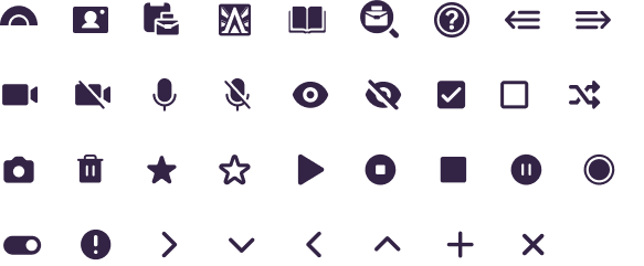
Iconography
For the iconography, I crafted icons specifically tailored to the product’s functionality. These included icons such as job interview, dashboard, find me a job feature, and looking for jobs, among others. As for the remaining system icons, they comprised well-known and commonly used symbols, requiring less creative input.
HI-FIDELITY PROTOTYPES
Student profile
(Initial Signup)
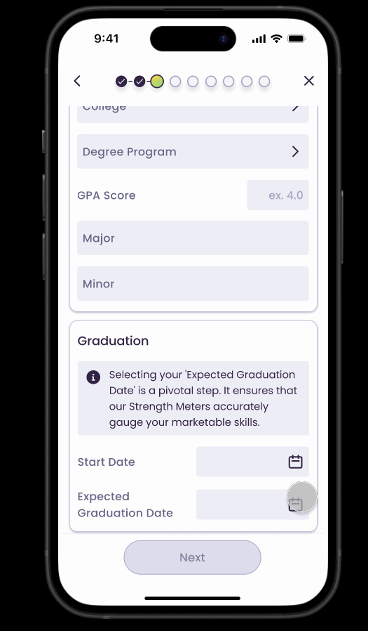
After arriving at the app’s initial screen, students are prompted to create an account and subsequently build a personalized profile.
This video prototype covers the first two steps of the profile.
Student profile
(Initial Signup)
After arriving at the app’s initial screen, students are prompted to create an account and subsequently build a personalized profile.
The prototypes cover the first two steps of the profile.
iOS prototype
Web-based application prototype
Student profile
(Exam assessment)
To illustrate a student’s progress in their professional journey, we implemented a Strength Meter. This feature gauges the user’s progress towards achieving their Actuarial Exams goal by graduation. It dynamically adjusts based on the number of exams completed and the proximity to graduation, offering a real-time indication of the user’s trajectory.
Web-based application prototype
iOS prototype
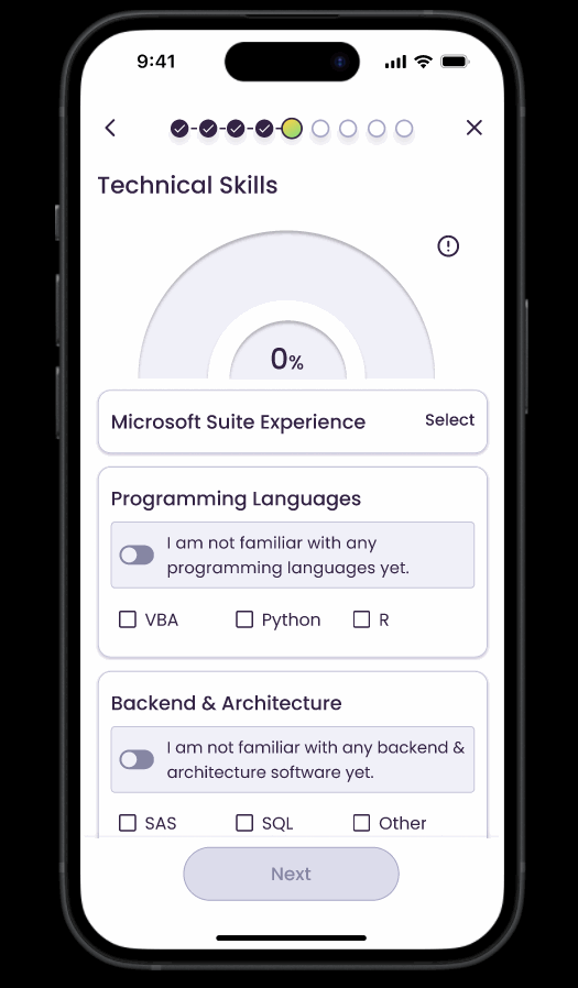
Student profile
(Technical Skills assessment)
Additionally, we’ve incorporated Strength Meters for Technical and Leadership skills, as well as Work experience, providing a comprehensive evaluation across multiple facets of the student’s development.
Student profile
(Technical Skills assessment)
Additionally, we’ve incorporated Strength Meters for Technical and Leadership skills, as well as Work experience, providing a comprehensive evaluation across multiple facets of the student’s development.
iOS prototype
Web-based application prototype
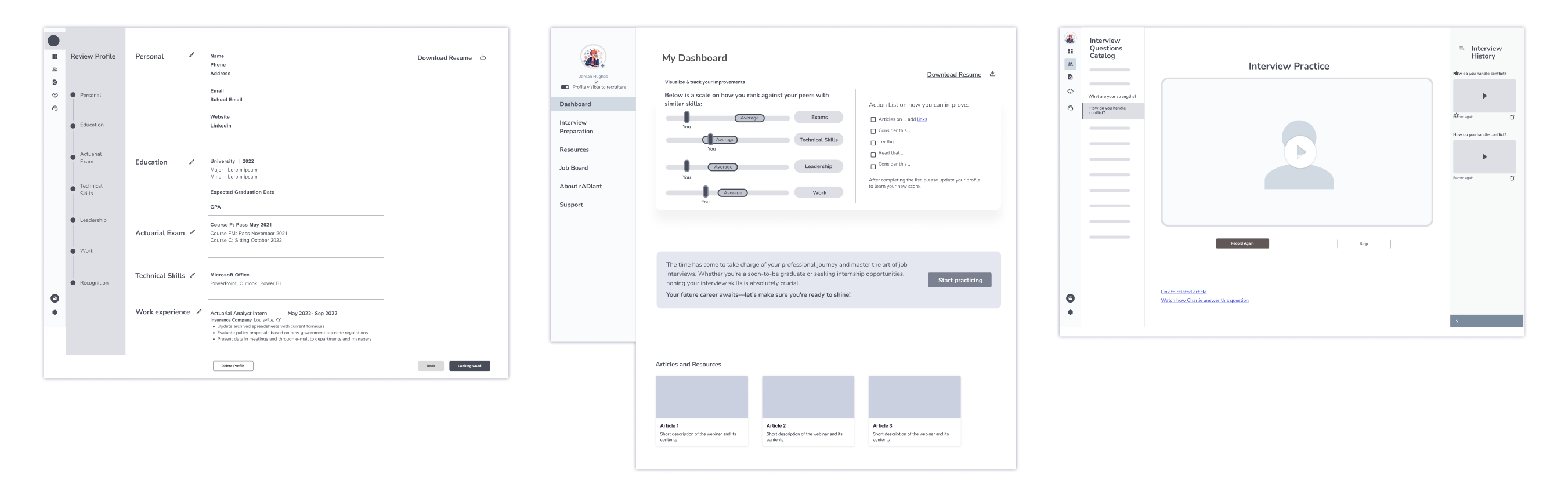
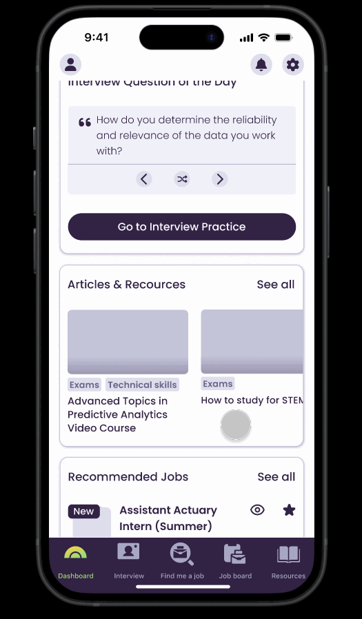
Dashboard
The Student Dashboard functions as a central hub with various informational elements. Students can easily view their overall score, broken down into different skills and percentages, providing a comprehensive overview to identify areas where they may lack skills. The dashboard also allows students to view and add upcoming exams.
Additionally, there’s a dedicated section featuring “Interview Questions of the Day.” This serves as a valuable tool for students to familiarize themselves with interview questions, keeping the feature at the forefront of their minds and making it less intimidating. If they choose, students can promptly record their answers by navigating to Interview practice screen.
Moreover, the dashboard offers tailored resources and recommends job opportunities for students to apply to.
Web-based application prototype
iOS prototype
Interview Practice
This feature became highly requested not only for providing glimpses of standard actuarial interview questions but also for lowering the barrier to help students become accustomed to speaking in front of a camera and recording themselves.
Students can browse through a plethora of questions organized into categories or opt for a random selection.
Once they click on “Ready to Record,” the side navigation bar collapses (if open), and both the left and right UI panels retract. This ensures a distraction-free environment for the recording process.
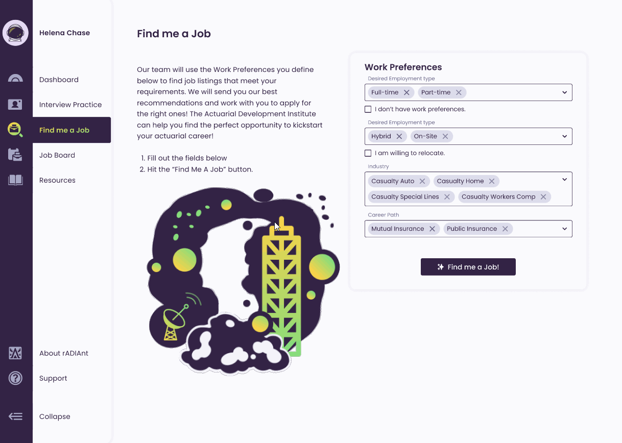
Find me a Job
For the “Find me a Job” feature, we had to work within tight time constraints, so we opted to release the feature with minimal functionality initially. When users had already specified their work preferences during profile creation, the dropdown fields would automatically populate with that information. Upon clicking the “Find me a Job” button, the user’s resume and contact details were transmitted to the rADIant team for review. A team member would then reach out to the user at a later time for further assistance. I capitalized on the opportunity presented by empty states and incorporated animations to enhance user delight.
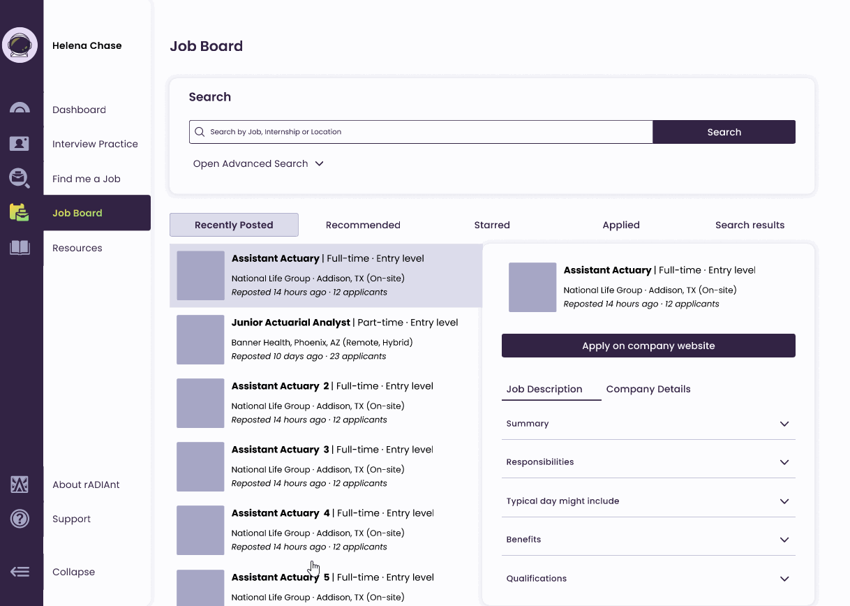
Job Board
The Job Board feature operates similarly to other existing online job boards, albeit with a heightened level of intuitiveness and customization tailored specifically to the actuarial field. Users can search for jobs using keywords and utilize advanced filtering options to refine their job listings, making the process more efficient and tailored to their preferences.
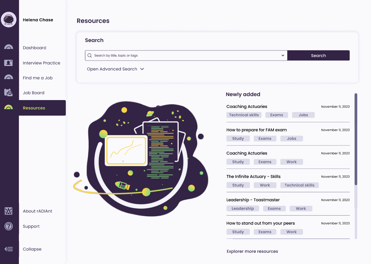
Resources
The Resources page serves as the central hub of information, allowing users to access a wide range of resources categorized by tags or searchable by keywords and topics. This feature provides users with a convenient and efficient way to stay updated on the latest news and information within the actuarial field.
Additional Empty States Animation
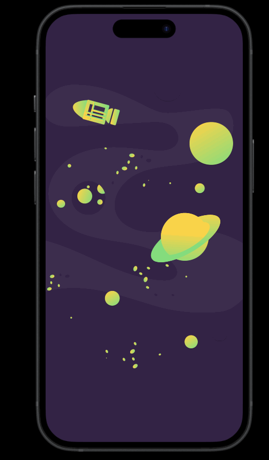
The space theme for the overall app was not randomly chosen. It represents the expansive possibilities for rADIant’s users, capturing the common goals of students and employers to aim high and succeed in their actuarial pursuits. Vibrant colors, including a deep purple and a green-yellow gradient, breathe life into the illustration. These colors infuse the visual elements with energy, symbolizing wisdom, growth, and a bright future within the actuarial realm.
Change Password
Support Page
About Page
Closing Thoughts & Reflections
We launched the project to Beta users in mid-December 2023, marking a significant milestone for us. Despite the tight deadline of six months, we persevered, though not without sacrifices, particularly in the development of student experience features. Additionally, we made the strategic decision to deprioritize the employer experience to phase 2. As a result, the rADIant Team will need to undertake considerable manual work to facilitate connections between students and their desired employment opportunities.
Reflecting on this project, I realize there are areas for improvement for future endeavors. One key aspect would be to familiarize myself early on with the framework that developers will be using. This would provide me with a better understanding of the framework’s constraints and limitations, enabling smoother collaboration and more informed decision-making.
Looking back, I also recognize that I could have approached the design differently. For instance, opting for solid colors instead of gradients might have been more prudent, considering the challenges we encountered with the framework’s compatibility with gradients. This adjustment could have streamlined the design process and mitigated potential complications down the line.