Background
My Role:
UX/UI Design | Prototyping | UX Research | Information Architecture
Timeline
6 Weeks
Team
1 Designer | 2 Project Managers | Team of Software Developers
Company
Level2 (Part of UnitedHealth Group)
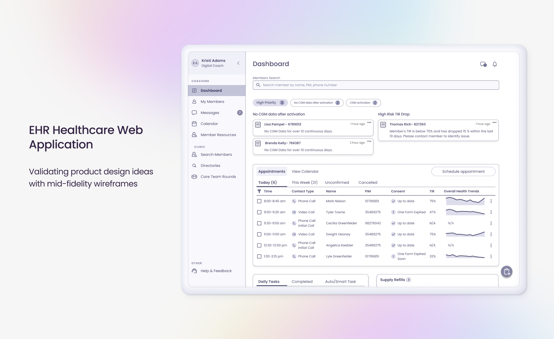
EHR Healthcare Web Application
Validating product design ideas with mid-fidelity wireframes.
UnitedHealth Group launched an innovative new therapy (Level2) that combines wearable technology (CGM devices in combination with FitBit watches) and customized personal support to help improve the health of people living with type 2 diabetes.
Level2 equips eligible participants with integrated tools that include a mobile continuous glucose monitor (CGM), activity tracker, app-based alerts and one-on-one clinical coaching to help encourage healthier lifestyle decisions, such as food choices, exercise and sleep patterns.
Problem Statement
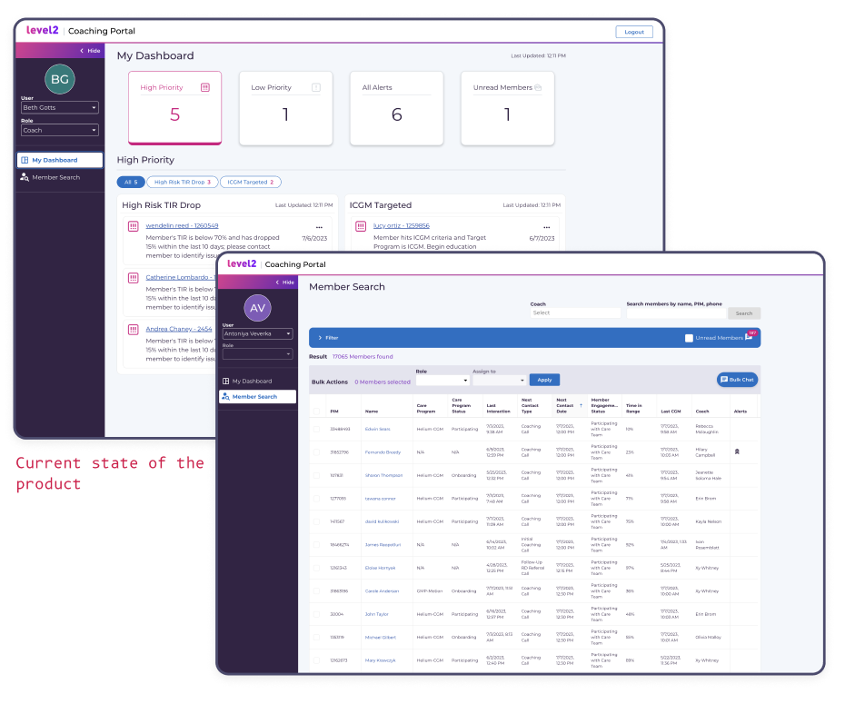
Level2 coaches faced confusion with the EHR system (Coaching portal), extending beyond navigation issues and basic UX principles. Challenges included ineffective member management, lack of critical information, leading to low engagement. Doubts about data reliability led to inefficient workarounds.
From a business perspective, budget resources allocated to training didn’t yield optimal returns due to coaches’ inefficient workflow, resulting in decreased engagement, retention, and overall program success.
Project Objectives
The project objective was to reimagine the Level2 Coaching Portal to enhance digital coaches’ experiences by eliminating confusion and frustration while increasing their efficiency without compromising effectiveness. This involved developing a mid-fidelity user-friendly interface to test new workflows, minimizing external tool dependency, ensuring reliable data management, and optimizing the user journey. The goal was to empower coaches to effectively support individuals with type 2 diabetes, fostering improved engagement and productivity.
Throughout the case study, I will use red text to mark my thoughts, and reflections, or provide additional context.
Deep dive into the case Study
UX Audit & User Research
Prior to joining the team, some user research had already been conducted. Upon joining, I shadowed several digital coaches during their coaching calls, taking notes and making observations. We also distributed five separate surveys to determine feature prioritization and create a backlog.
Access to training materials allowed me to spend extensive hours delving into their workflow. Following this, I conducted a UX audit on the existing coaching portals, making notes on user flow, system alerts, information presentation, and overall user experience.
User Persona Identification
After extensive research, including user interviews and a thorough review of training materials, I identified five primary user personas: Digital Coaches & Digital Lifestyle Coaches, Registered Dieticians, Nurses & Providers, and Patient Care Coordinator.
Notably, the Digital Coaches and Digital Lifestyle Coaches emerged as the user groups with the highest interaction levels with both members and the Coaching portal. To validate new features and refine the Coaching portal design, my focus was specifically on these user segments.
Digital Coach - Kristi Adams

Background
- Her family was personally impacted by Type 2 diabetes.
- Digital Coach at Level2 for over a year.
- Manages 158 members with Type 2 diabetes.
- Regularly connects with members on a weekly or monthly basis.
Challenges and Frustrations
- Juggling multiple platforms for member tracking.
- Nightmare scheduling and rescheduling due to a lack of synchronization between the various platforms used for member management.
- Meeting new members involves manual processes like copy/pasting templates and extensive documentation.
Goals
- Provide effective and personalized support to each of the 158 members.
- Improve efficiency in scheduling and documentation processes to enhance overall coaching experience.
Motivations
- Driven by the desire to make a positive impact on the health and well-being of individuals with Type 2 diabetes.
- Motivated to enhance coaching processes for a more seamless and efficient experience.
Wants
- Streamlined Member Tracking – Desire for a unified platform to streamline member tracking, eliminating the need for multiple platforms.
- Efficient Scheduling – Seeks an efficient scheduling system to simplify the challenging task of scheduling and rescheduling appointments.
Automation in Onboarding – Wants automation in onboarding processes to reduce manual tasks such as template copying and extensive documentation
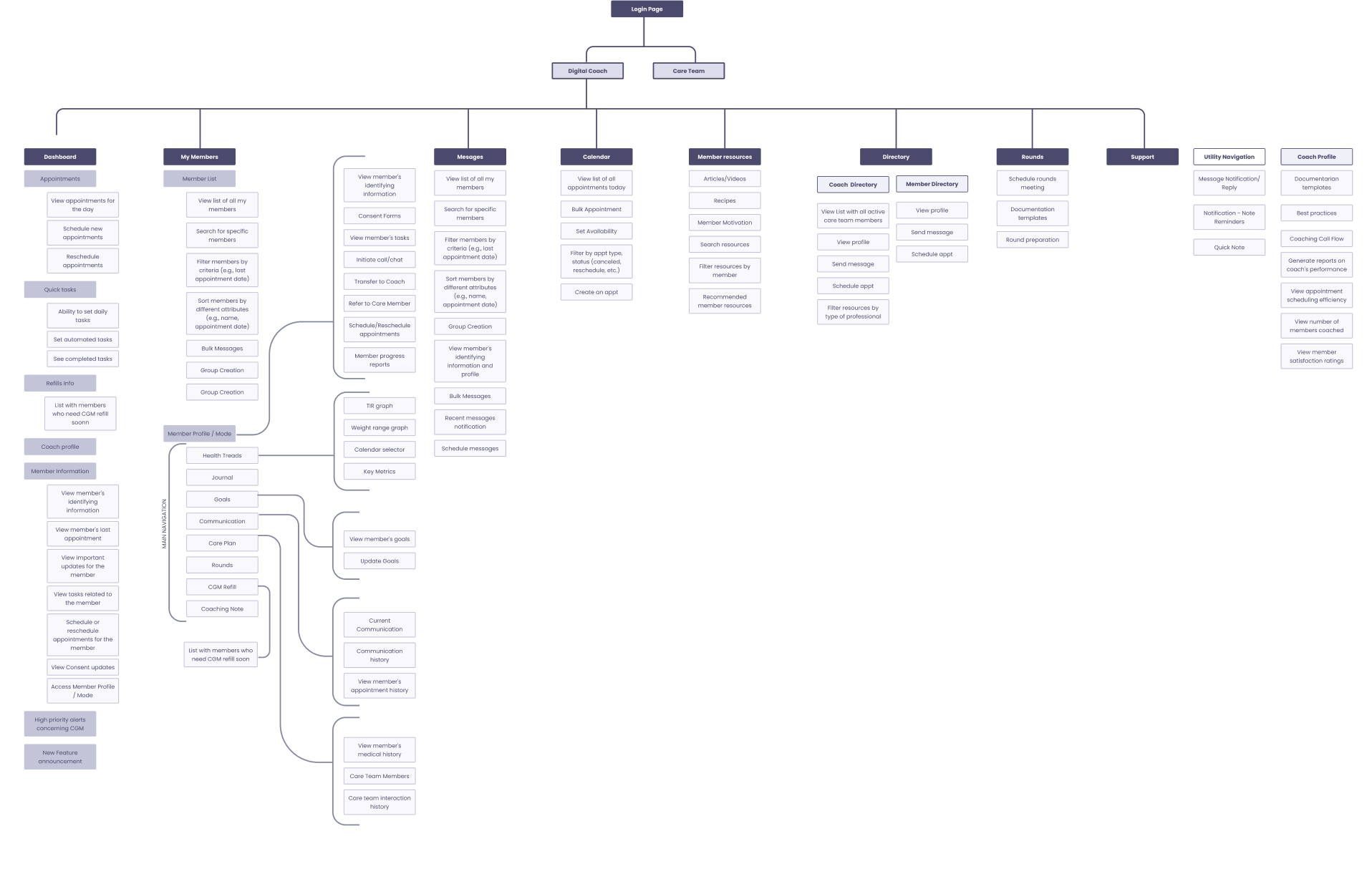
Information Architecture
In addition to having access to coaching training materials, workflows, and templates, I underwent an 8-hour synthesized version of digital coaching training. This experience provided me with a more profound understanding of how coaches are expected to document all interactions with their members and the diverse range of software tools integral to their workflow.
Mid-fidelity wireframes & prototypes
Dashboard
(Current state)
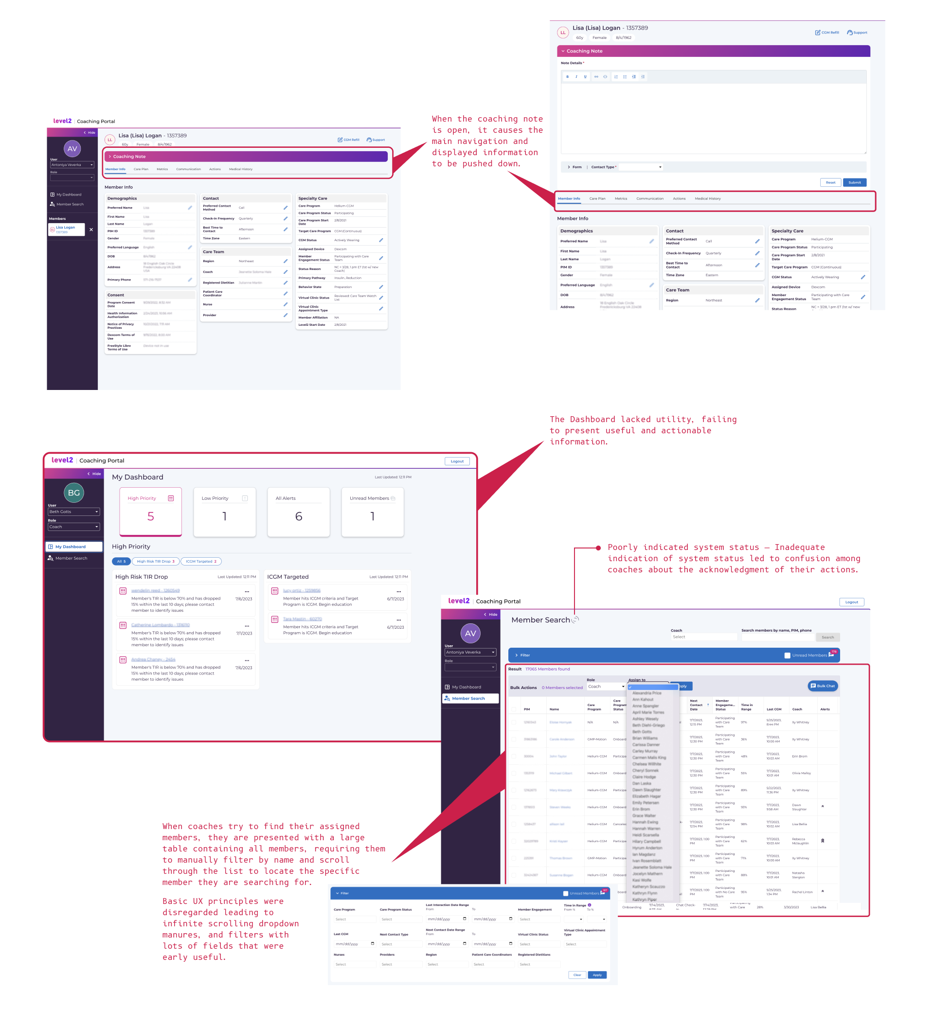
In 2024, our shared mental model of dashboards portrays them as centralized command centers providing clear overviews of vital information and actionable insights. However, the current state of the dashboard diverged significantly from this ideal, offering only a brief glimpse of recent CGM readings.
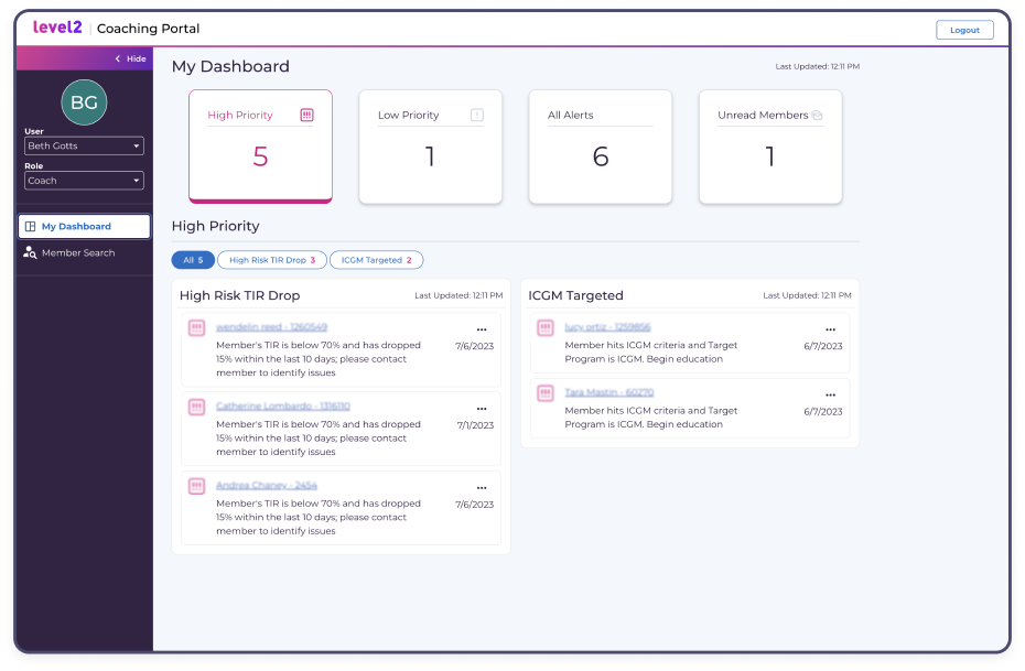
Quotes from User Interviews
“I have so many members that it’s hard to re-orient myself as I go into the next coaching call.”
Coaches searched the entire Level2 database to find their members, without an easy way to see only their own assigned members.
“I can’t manage back-to-back coaching calls”.
Coaches utilized separate software exclusively for scheduling appointments, lacking access to their members’ details within that system.
“Preparing to meet with new members is tedious and time consuming.”
“I don’t have a way to see the member’s progress over time.”
“I can’t just look at one spot and understand who this member is, what was last discussed, and where their health is at.”
“It’s not easy to tell if the member has been improving or regressing.”
“Preparing for a call is time consuming.”
“I have to look at the previous coaching session note to figure what coaching session # the current one should be.”
There was no automated log to track coaching interactions. Coaches did that manually.
Dashboard
(Dashboard Revamped)
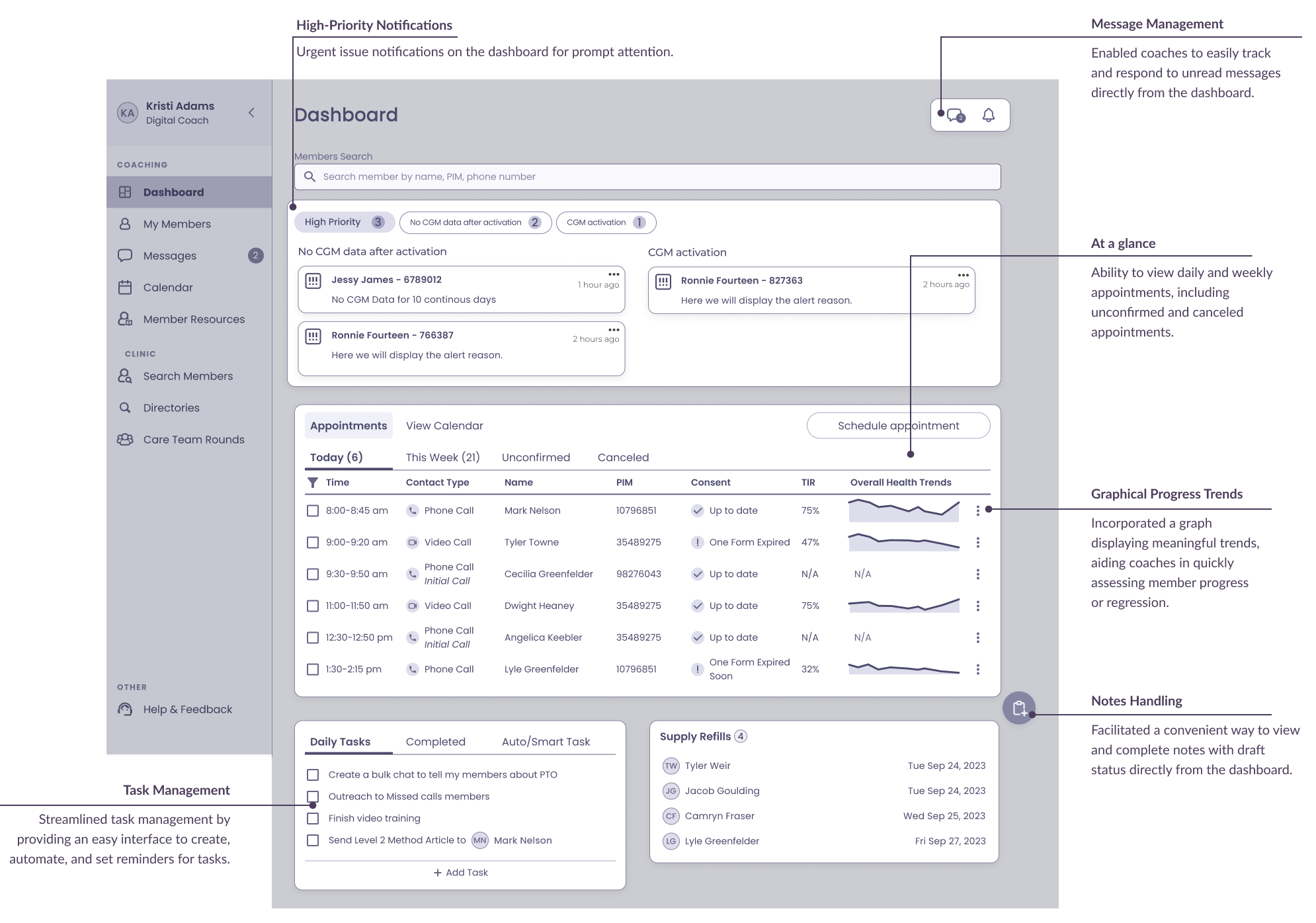
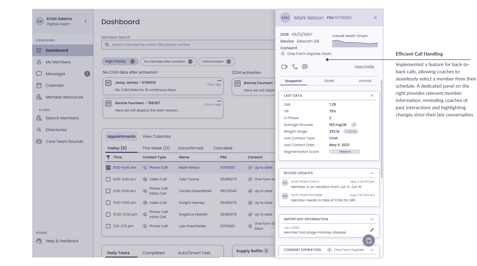
Upon logging into the Coaching portal, coaches encounter a dashboard featuring a prominently displayed high-priority notification requiring immediate attention. The dashboard provides an overview of daily and weekly appointments and offers the option to create both daily and automated tasks. Selecting a member from the calendar activates a panel on the right, showcasing member verification details, recent updates, consent validation, reminders, and the ability to schedule or reschedule a call.
Approach to the Problem
Highlighted Features
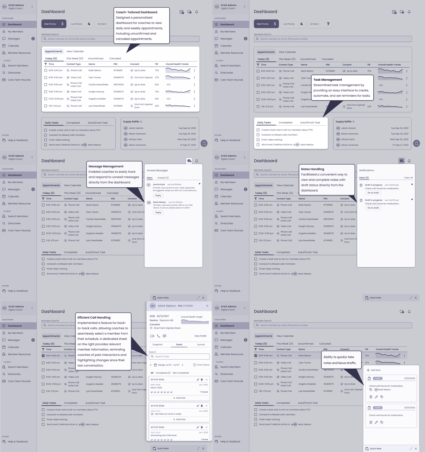
Prototype
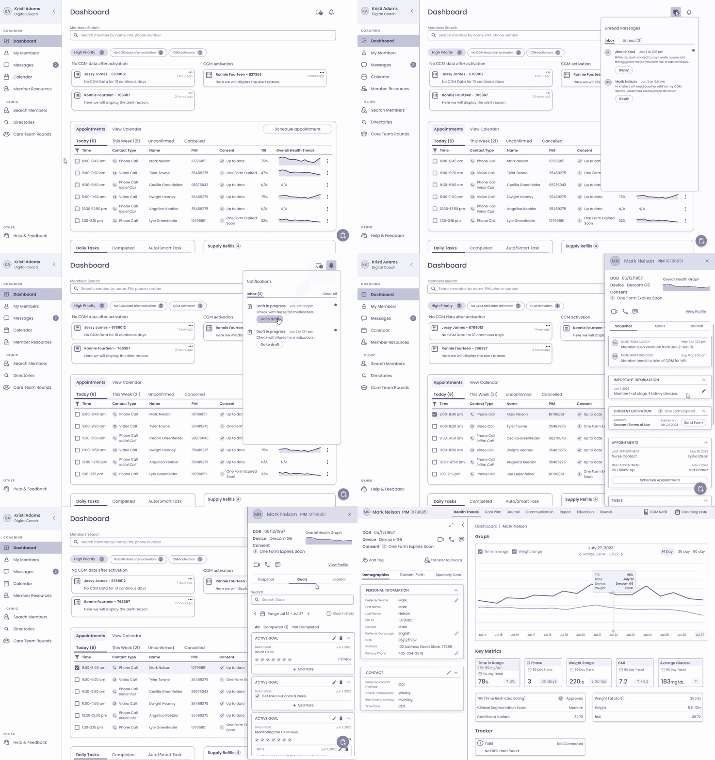
Prototype


Approach to the Problem
Coach-Tailored Dashboard
Tailored dashboard for digital coaches to access daily and weekly appointments, including unconfirmed and canceled bookings.
Graphical Progress Trends
Incorporated a graph displaying meaningful trends, aiding coaches in quickly assessing member progress or regression.
Task Management
Streamlined task management by providing an easy interface to create, automate, and set reminders for tasks.
Message Management
Enabled coaches to easily track and respond to unread messages directly from the dashboard.
Notes Handling
Facilitated a convenient way to view and complete notes with draft status directly from the dashboard.
Efficient Call Handling
Implemented a feature for back-to-back calls, allowing coaches to seamlessly select a member from their schedule. A dedicated panel on the right provides relevant member information, reminding coaches of past interactions and highlighting changes since their last conversation.
High-Priority Notifications
Urgent issue notifications on the dashboard for prompt attention.
Member Profile
(Current state)
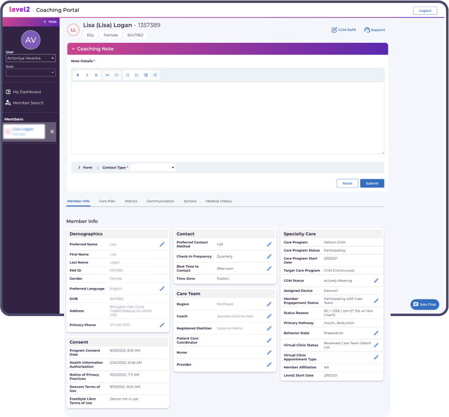
During interactions with a member, coaches often found themselves engaged in extensive manual tasks, repeatedly copying and pasting templates to align with both their individual workflow and the standardized approach among coaches.
Additionally, when the coaching note was open, tab navigation can be displaced below the fold, creating challenges in seamlessly navigating through different tabs to locate necessary information.
Furthermore, digital coaches faced a significant challenge as there is no notification or alert system for expired consent forms. This became a major issue since conducting an interaction requires up-to-date consent forms.
Quotes from User Interviews
“I copy and paste the old note into Word so I can easily make the updates from the previous session.”
Coaches need a selection of templates they could choose from depending on the interaction.
“I have to set up member engagement status verifying that I outreached to the new member.”
“I conduct coaching sessions in a word doc because I move around the coaching portal too much when on a call.”
“I have to click through multiple tabs just to figure out where this person is at in their journey.”
“While the coaching note is open, I have to scroll down the screen to see the tabs.”
“I want to remind myself to check back in with the member in a couple weeks to see if they’ve taken action on what we discussed.”
“I have to submit a coaching note every time I interact with a member.”
There was no automated history log.
“I can’t figure out what content to share with a member.”
Member Profile
(Member Profile Revamped)
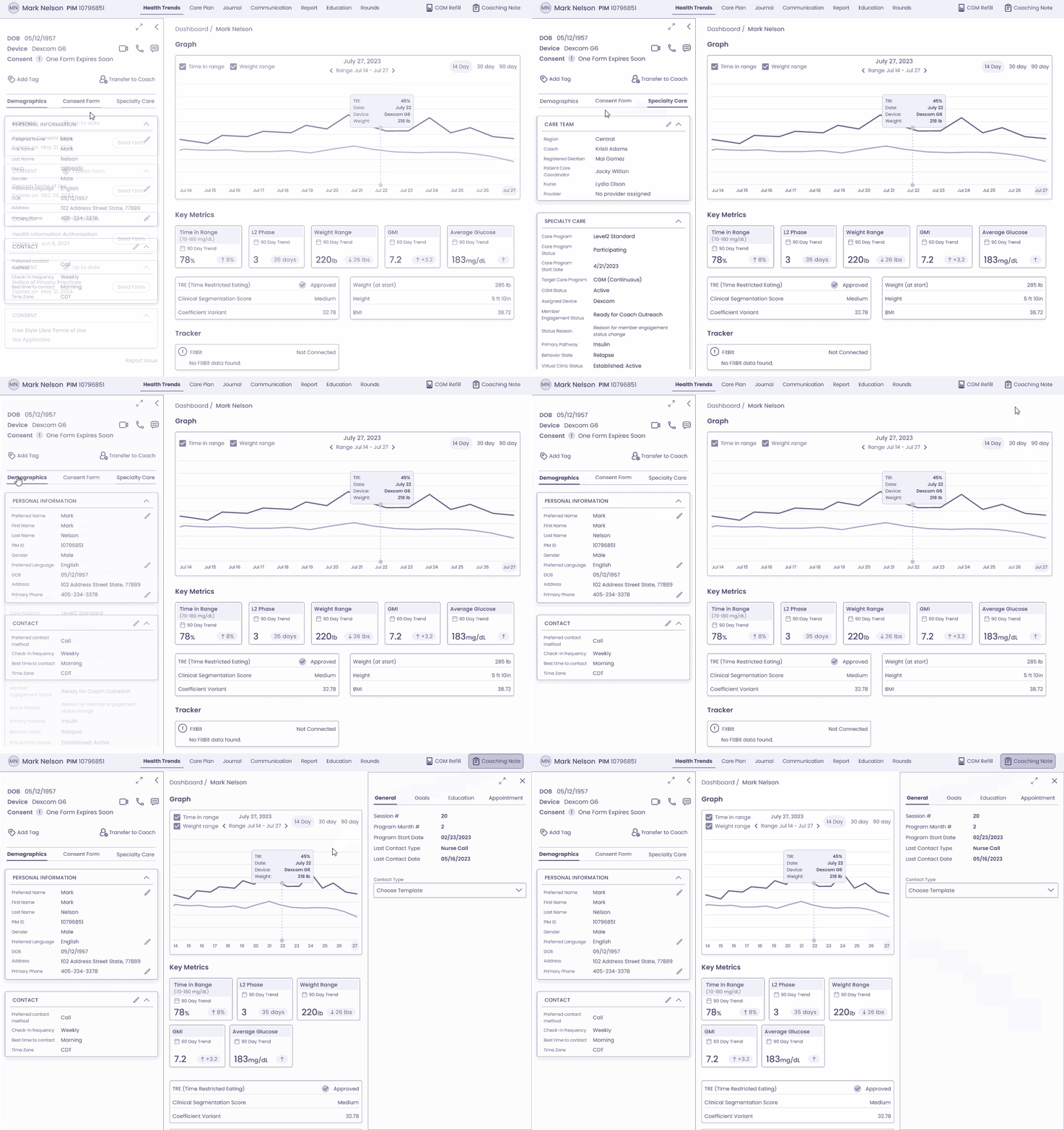
To access comprehensive health details of members, a digital coach can enter the Member mode. Here, they can review pertinent health information, verify HIPAA compliance, and ensure all consent forms are current. The main screen features a graph displaying the Time in Range (TIR) and weight trends, while key metrics are highlighted in distinct cards.
Approach to the Problem
Member Mode Entry
Digital coaches enter Member mode for detailed health information.
Health Data Review
In this mode, coaches examine pertinent health data, ensuring HIPAA compliance and consent form currency.
Main Screen Presentation
The main screen exhibits a graph depicting Time in Range (TIR) and weight trends.
Key Metrics Highlights
Key metrics are highlighted in distinct cards for convenient reference.
Initiate Calls
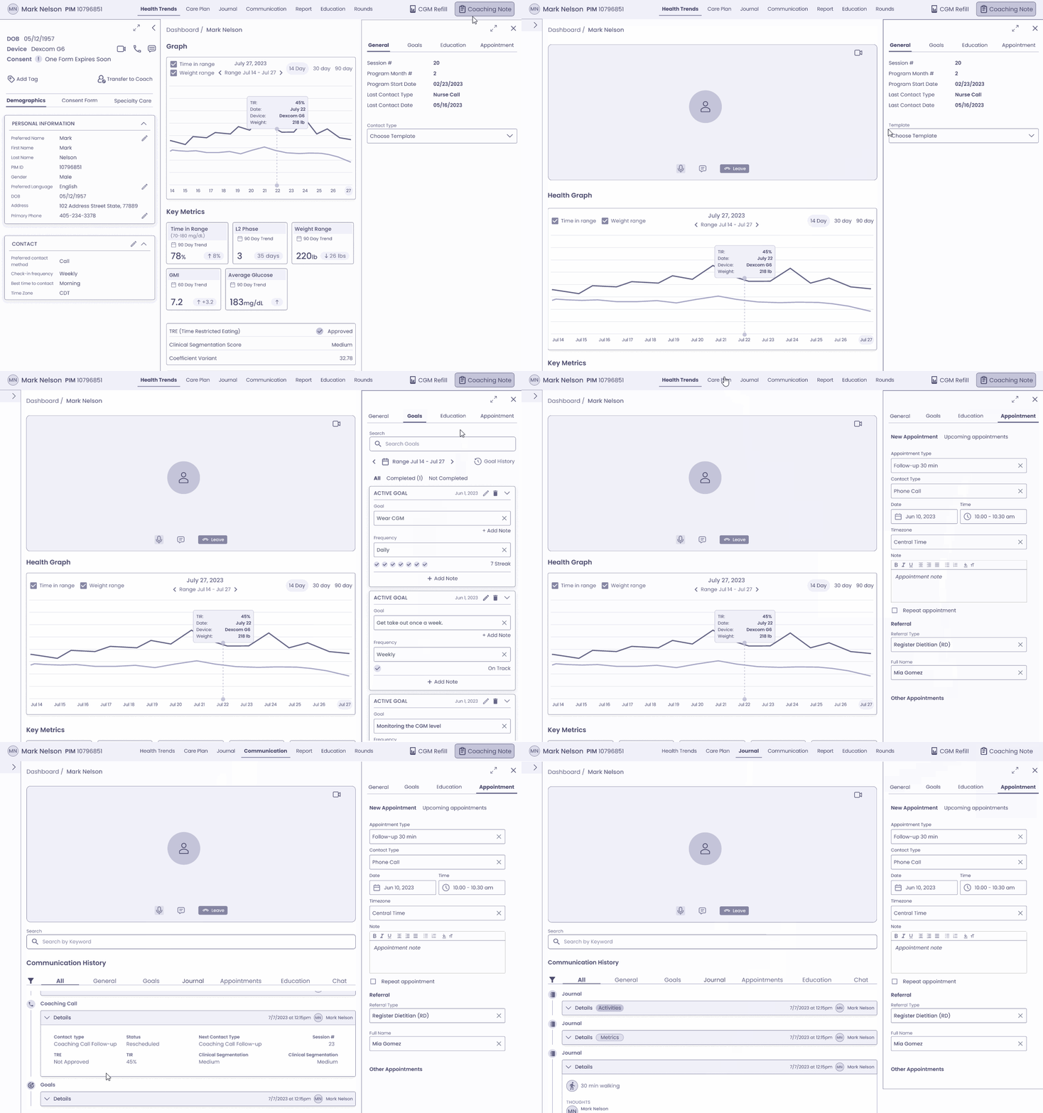
Coaches can initiate both video and phone calls directly from the coaching portal.
Expandable Panels
Left and right panel are expandable or minimizable for enhanced flexibility during calls.
Efficiency in Workflow
Coaches can easily choose a template note tailored to the specific interaction, ensuring consistency and standardization in interactions. It eliminates the need for manual copy/paste, streamlining the workflow for coaches.
Efficient Member Mode Navigation
Coaches can easily navigate through Member mode not only during calls but also for self-reminders about the member’s journey progress.
Member Search
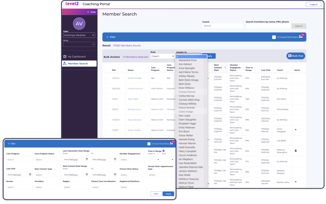
(Current state)
In the existing Coaching Portal, numerous columns and filters were present, and their usage by coaches was unclear. To address this, a survey was distributed, seeking feedback on the potential removal of both. The objective was to understand which user segments utilize specific columns and filters, and determine the necessity of retaining or eliminating them based on user preferences and needs.


Approach to the Problem
Adopted familiar table format from existing system
Leveraged the table format that coaches were accustomed to using in the current system, ensuring familiarity and ease of use.
Assigned members
Created a separate screen specifically tailored to showcasing members assigned to each coach, enhancing organization and clarity.
Continuity in user interface
Maintained consistency with the overall interface design, ensuring that the new screen seamlessly integrated with the existing system.
Minimized learning curve for coaches
By utilizing familiar formats and interface elements, minimized the amount of new information coaches needed to learn.
Streamlined and efficient view of assigned members
Optimized the display of assigned members to offer coaches a clear and efficient overview, enhancing their ability to manage their caseload effectively.
Messaging
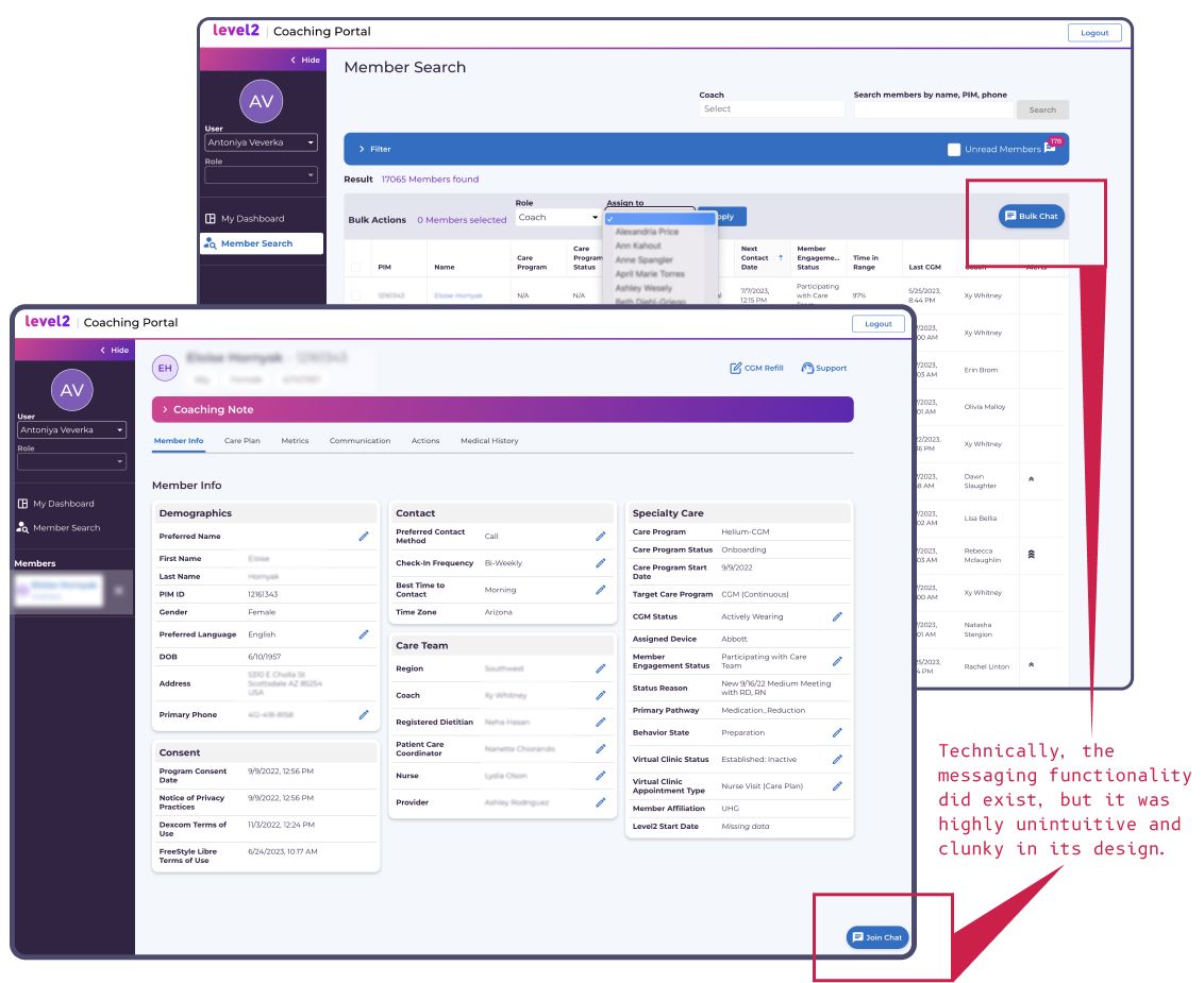
(Current state)
Messaging functionality existed in the Coaching Portal; however, it was notably clunky and unintuitive. Sending a bulk chat required coaches to manually search through the member database to locate their assigned members. Additionally, there was no option to schedule messages. For direct messages to a member, coaches had to go to the member’s profile and send the message from that specific interface.
Approach to the Problem
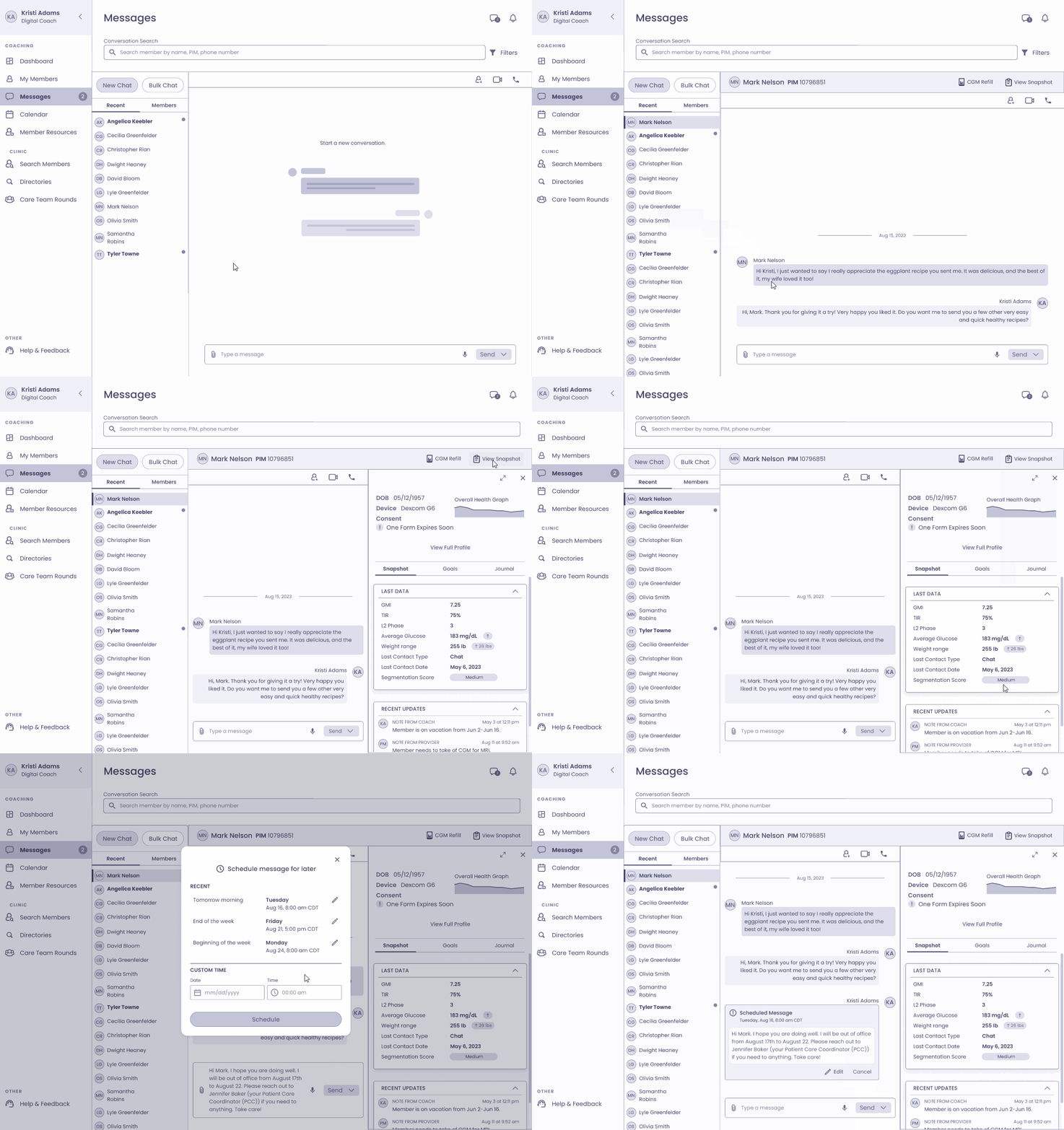
Enabled single and bulk messaging
Provided coaches with the capability to send both individual and group messages, offering flexibility in communication.
Added message scheduling capability
Empowered coaches to schedule messages for future delivery, optimizing communication planning and efficiency.
Provided access to member Snapshot information
Integrated member Snapshot data within the messaging process, enabling coaches to access essential information while communicating.
Facilitated profile viewing
Allowed coaches to view member profiles directly from the messaging interface, streamlining the process of accessing additional details as needed.
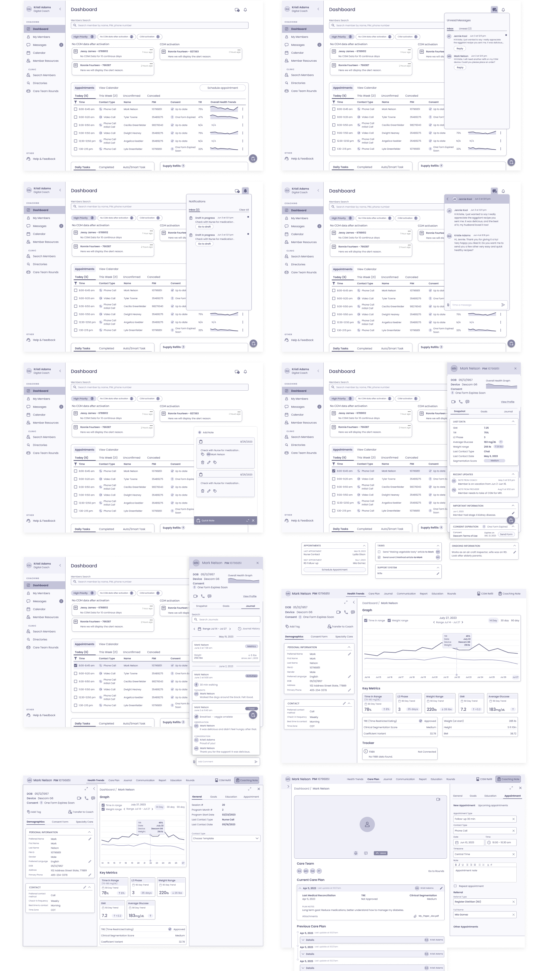
Final Mid-fidelity wireframes
Closing Thoughts & Reflections
Numerous user flows were designed throughout the project. Regrettably, by the time we reached the stage of testing our mid-fidelity prototype with digital coaches, I had left the team. Despite my departure, the groundwork laid in understanding user needs, proposing features, and refining the portal’s structure provides a sturdy foundation for future testing and iterations.
In summary, the project journey has provided invaluable insights into the realm of digital coaching, pinpointing areas for improvement and setting the stage for a more user-centric coaching portal. The proposed changes and features aim to address specific pain points, ultimately enhancing the overall experience for digital coaches supporting individuals with type 2 diabetes.
